Sunday, June 26, 2011

Gene Colan: How Do I Make Him Love Me?


by BK Munn

Imagine my surprise this afternoon, just days after learning of the death of comic book artist Gene Colan, to be offered for sale by a total stranger a small pile of books and magazines including exactly one comic, My Love #13, published in 1970 by Marvel Comics with cover by John Buscema and Frank Giacoia and a lead story illustrated by Colan, "How Do I Make Him Love Me?" I bought the lot based on the Colan story alone, thinking the coincidence too significant to ignore.


Along with Our Love Story, the My Love title was part of Marvel's re-entry into the romance comics market in the late-1960s and early-1970s. These titles were made up of new stories plotted and scripted by Stan Lee and his small stable of writers and co-plotted/illustrated by the Marvel Bullpen of artists from the regular superhero/action side of the company, including John Buscema and John Romita. Most issues also featured reprints of earlier Marvel romance work (often updated by artist Marie Severin) as well as the "Suzan Says" advice column penned by Marvel secretary and "Girl Friday" Suzan Pasternak (aka Suzan Loeb). These 70s romance comics are fascinating in part because they offer us a glimpse of these popular artists creating more adult, less fantasy-oriented material for a female audience, while at the same time they reveal the degree to which the Marvel comics of the time had become dominated by romance tropes in terms of both story and visuals, the classic Marvel soap-opera style of plotting that emphasized strong female supporting characters and continuing erotic entanglements for the hero. The classic examples of this peak period are the John Romita-illustrated Spider-Man, with characters like Peter Parker's girlfriend Mary Jane Watson, and the Gene Colan-illustrated Daredevil, featuring the sexy super-spy and Matt Murdock love-interest, The Black Widow.


Despite this genre crossover, the romance comics represent a separate comics reality and allow the artists to flex different muscles. Although shorter than the superhero adventures of the time (most are between 6 and 8 pages long), these anthology stories by their nature devote more space to the subtle emotional states of their protagonists and are interior, domestic, and humanly-scaled where the superhero comics are often focused on gargantuan public spectacle and violent expressions of emotion. The artists respond to this different subject matter with a more varied approach, using more filmic and comic strip-y techniques like montage, atmospheric shading and colour, and lots of close-ups and medium two-shots.


The Gene Colan story in My Love #13 is a fairly sedate example of this approach, a 6-page tale of a young woman learning how not to scare away her boyfriend by seeming to be overly bold, needy, or desperate (the moral: quit calling him and try playing a little hard to get). In "How Do I Make Him Love Me,” written (or at least “dialogued”) by Stan Lee, Colan's art serves the script with economy and clear cartooning, with pages laid out in more-or-less conventional 5, 6, and 7-panel grids that give equal weight to each panel beat or scene. Frequent collaborator Bill Everett's fine, woodcut-style inking perhaps mitigates any variation in line and shadow that may have been present in Colan's original pencils, rendering everything with a well-lit clarity although there still are one or two shadowy panels and a moody urban night scene (and the story's protagonist seems to morph facially between a Susan Dey-style hippie and an arched-eyebrow Atlantean princess).


Throughout, Colan demonstrates his skill at depicting realistic street scenes, gesture, and facial expression, augmented by cartoon devices, camera angles, and caricature. In one panel, even the young lovers' bell-bottom jeans seem to share in their carefree experience of a fun day at the amusement park, splaying out wildly like a fashionable version of Dr. Strange's animated cape. In other panels, the extremely dramatic angles highlight the importance of the telephone to the plot.


Sunday, May 29, 2011

Kirby Costume Design


Through tattered clothes great vices do appear; Robes and furred gowns hide all. Plate sin with gold and the strong lance of justice hurtless breaks. Arm it in rags, a pigmy's straw does pierce it. --King Lear 

"Creatures of man's adaptation to radiation, Ben and Renzi use a biological process similar to atomic fission to change their bodies into steel-like armor..." --Kamandi #8

Are the clothes we wear costumes? Do we disguise ourselves daily and moment-to-moment through the simple act of putting on a new pair of shoes or a clean shirt? How are we the designers of own characters and our own lives?

Two things I've been devouring lately: the 50th issue of The Jack Kirby Collector (aka Kirby Five-Oh!) and various Kirby comics from the 50s, 60s and 70s. The giant Kirby Collector issue, published in 2008, is made up of a number of themed articles incorporating the number 50, including a list of top 50 character designs by Sean Kleefeld. You should really seek out the issue to read Kleefeld's arguments, but the list really got me thinking about Kirby's approach to costume and character and I started looking more critically at some of his superhero and monster comics with a focus on costume.

Ten Classic Kirby Costumes

1. Ant-Man: A pure superhero costume. The design incorporates totemically aspects of the character's namesake powers in a very bold and stylized manner. The helmet is functional in that it serves as a both mask and source of his power (ability to communicate with and control ants). At the same time it looks like an ant head! The rest of the costume follows the conceit of the helmet. The ant symbol on the costume is stylized almost to the point of abstraction.*


2. White Zero: This is Kirby doing a generic superhero costume and gives us an idea of how he might approach the idea of the superhero as an outsider, almost as parody, but using a more intellectual attack than in Fighting American or Brand Echh. A Kirby cosmic design that is also more of a traditional superhero than almost anything he created after 1970.


3. X-men: Iconic, versatile team uniform design, great colour scheme and logical. The idea of a school uniform grafted onto the superhero.


4. OMAC: Very unique costume that spotlights a Kirby design feature that few other older artists outside of the classic strip creators paid attention to: hair. I could write a whole separate list of best superhero hair, but suffice to say that OMAC's mohawk elegantly marks him as both futuristic and a warrior, perfect visual shorthand. The rest of the costume, including the all-important, all-seeing central eye, is nothing to sneeze at either.

5. Capt. America: One of the first iconic Kirby designs. I've read that Joe Simon did the initial sketch but Kirby certainly refined Cap to an elegant purity over the years.

6. Impossible Man: Besides being a great fun character with a classic colourful look, Impy is representative of that whole trademark Kirby skinny alien approach to character design.


7. Ikaris: A personal nostalgic favourite and representaive of the elaborate goofy god designs.

8. Klaw: A great villain design and one of the first, along with Quicksilver, zig-zag costume designs.

9. Thing: Simple, but visually interesting. Instantly recognizable, even though never drawn the same way twice. The Thing makes the character's skin the costume.

10. The Demon: see below.


-----
I like the generic 70s heroes (White Zero, Manhunter, Sandman) and the monsters-in-trunks (Thing, Demon, Karkas) for their simplicity and streamlining. But I have to admit that what makes Kirby interesting is the more trademark weirdness. The busy-ness and extraneous zig-zag zaniness. In terms of the heroes, maybe Thor was the first of that lot? Certainly the various gods, both New and Norse, exemplified that approach the most. There are interviews in Kirby Five-Oh with Kirby pastiche artists like Joe Casey collaborator Tom Scioli and John Romita Jr (he illo'd the Neil Gaiman Eternals heresy) and lots of talk about the modern approach to making the Kirby gods uniforms look more logical, or more like skins, since we can't imagine immortal beings with control over atoms pulling on their pants like a normal person, even though the "uniforms" should really be seen as ceremonial or religious garb, not a uniform per se. The great thing about the costumes, however, is that Kirby DID imagine these gods pulling on their pants like a normal person. We can imagine him saying to himself, to the extent he ever verbalized his creative process, "This is a super-god, so therefore he needs a super-god costume, like a superhero's but more awesome. Naturally, this includes a pair of trunks on top of leotards. But these are cosmic trunks and extra-dimensional leotards." Sometimes he shows someone like T'Challa ceremoniously putting on the Panther suit, or suddenly transforming (Ben Bolt, Sersi), but mostly the latter-day cosmic Kirby heroes have very little in the way of civilian garb and wear their costumes like everyday clothing. Of course, the weirdness of the clothing lends a certain majesty or alien-ness to the characters. I like to imagine Ikaris or Orion pulling on their wrestler-style shorts or stiff loincloth one leg at a time, just like any other super-schlub. In Kirby's proletarian approach, this seems perfectly natural.

Some of Kirby's costumes seem designed around a functionality or specific use or feature, but still combine with a ritual/cultural look. I'm thinking of Black Bolt's wings and antennae, Metron's circuit diagrams, and Orion's helmet and astro-harness (without which he looks naked). The classic example is Captain America, a mix of propaganda and army uniform, gaudy and utilitarian.

One of my favourite examples from the pile of Kirby comics I've recently read is "Witchboy!" from The Demon #7 (March 1973): Kirby teams up his two 1970s DC magic characters in a story where The Demon rescues Klarion from the pursuing puritan-garbed elders of The Beyond Country. Quite wonderful pacing, great characterization. The Demon lives in Gotham City and as Jason Blood he goes to parties with his friends. He has a sexy blonde girlfriend named Glenda Mark. She has a wide forehead with dark eyebrows. Every single panel here is sheer delight, each with some novel graphic detail, variation in perspective and camera angle, and lots of action. Sometimes Kirby drops the backgrounds but his larger panels and spreads have unique, economic-yet-decorative scene-setting detail. The Demon's costume is interesting. Supposedly medieval, it is made up of a red jersey with matching cuffs/bracelets and matching black-and-white circular pattern, red belt and shorts, with little red booties, and a baby blue cloak/cape fastened with a circular yellow clasp, all of which contrasts nicely with his yellow skin and red eyes. The Demon often drapes the cloak over himself and can use it as a magical prop, as when he covers up Klarion and makes him vanish at the end of this story. Jason Blood, The Demon's alter ego, is distinctive as well. Cut in the heroic leading man mold, his craggy good looks and broad shoulders are accented with slightly-pointed ears and curly eyebrows, topped off by slicked-back red hair with a distinctive widow's peak and a broad white streak. The red hair is a nice piece of continuity with his surname and The Demon's costume.

Klarion's outift is less interesting but still graphically bold: a simple blue/black puritan-style suit. He gets his graphic impact from the contrast between the skinny, purple/black-clad child's body and large head with big eyes and expressive features, including two horn-like curls on the top of his black hair. For further contrast, Klarion carries around the orange cat Teekl, his tiger-like familiar. Both Etrigan and Klarion are mischeivous and laugh alot. Both are fun variations on the standard superhero type with ancestry in earlier Kirby concepts. The Demon is one of Kirby's monster heroes (The Thing, Hulk, Karkas), but with a more sophisticated power set (spells, flame-throwing), and Klarion, as a sort of delinquent child/adolescent, has much in common with Kirby's kid gangs (Newsboy Legion, Boy Commandos). They make a good team, an oddball witchy couple with Klarion the troublesome nephew and Jason Blood/Etrigan the good-natured, wise and protective uncle!


----
For reference: Kleefeld's Top Ten.

1. Silver Surfer
2. Black Panther
3. Warlord Kaa the Living Shadow (st79)
4. Marvel Girl/X-Men
5. Black Bolt
6. Demon
7. Skrulls
8. Odin
9. Kang
10. Kirby's Children

The list has tons of famous and obscure characters as well, like Mark Moonrider (#16), and The Goozlebopper (#49). But no MODOK (monster-meets-Metron?).


*I have to admit that many conversations with the cartoonist Seth on the subject of the excellence of Ant-Man may have influenced this ranking.

Tuesday, May 17, 2011

Mad Dogs and Canadians


I was slightly drunk when I concocted this but at the urging of Brad Mackay I am posting it.

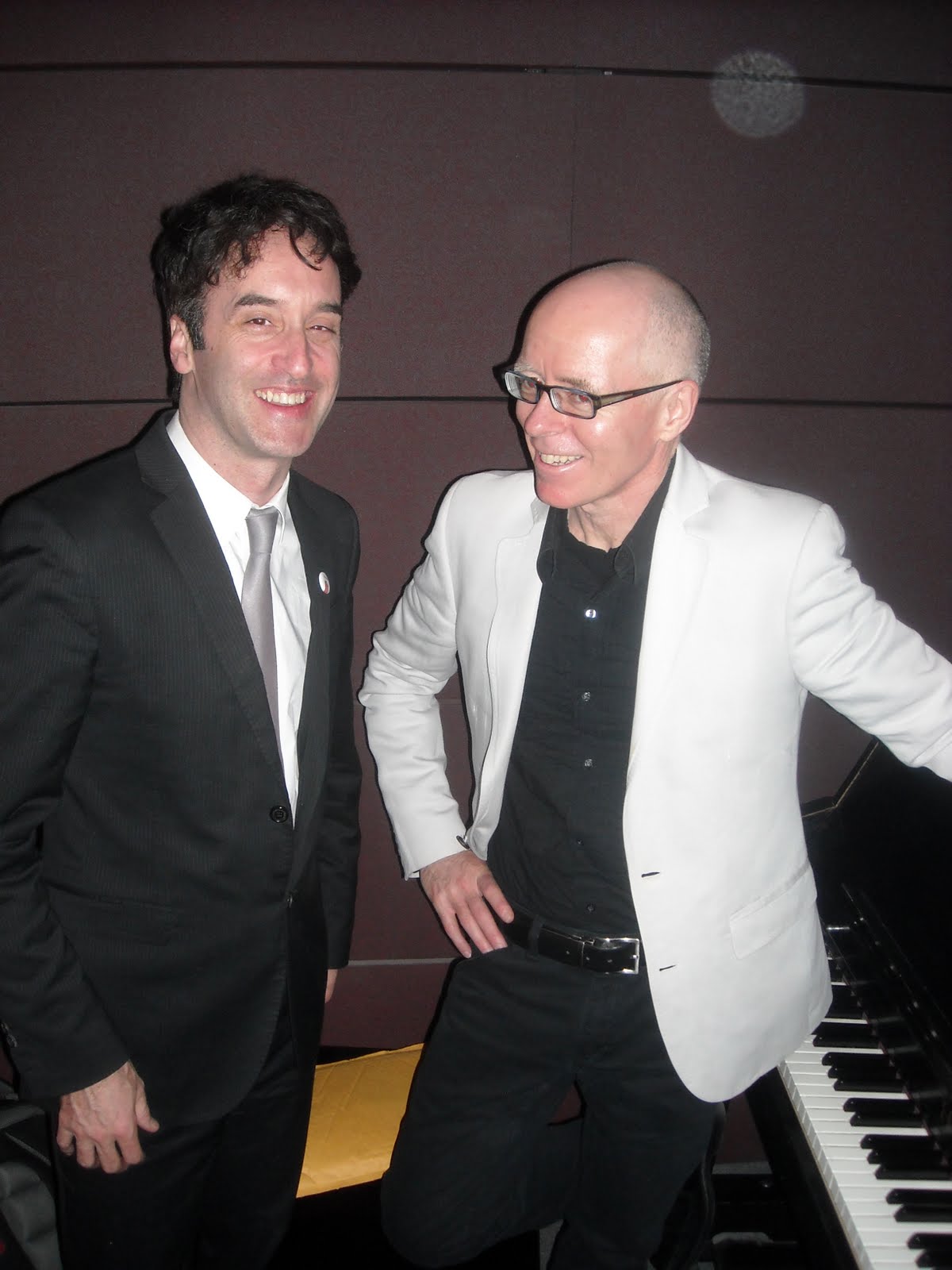
Isn't it funny how many of us had our first exposure to classic Tin Pan Alley songs and showtunes through Mad Magazine? Inspired by the Wright Awards and the presence there of the Tony-winning Drowsy Chaperone composers Don McKellar and Greg Morrison (pictured above), I present this travesty:


Made in Canada Comic Book Publications
(sung to the tune of "Mad Dogs and Englishmen Go Out in the Noonday Sun")

In northern climes
There are certain kinds
of gay
and bohemian engravers
who rebel against your New York-based
comic book enslavers.
They are some of the fools
Who work their tools
All day
Because the need to publish comics
Must ignore the economics
and pay.

The natives blink
When the cartoonists
sling their ink
Because they're obviously,
Definitely
Nuts.

Made in Can-a-da
Comic Book
Publications!

The Japanese have manga,
and Tezuka is lingua franca.
Belgians and Americans
Have Herge and Obama
But Canadians
Just love their
Koyama.

In the Philippines
They have Nino and Alcala
To provide Marvel books with ink.
The United States
Has work-for-hire rates
and the legacy of Kitchen Sink.
In Montreal
With love for all
We have Drawn and Quarterly.
With Doucets and Chester Bruns.

Made in Can-a-da
Comic Book PublicationS!

Such a surprise
For the eastern eyes
To see,
That though the cartoonist are effete,
They won't admit to defeat.
When Andy Brown arrives,
Every Maritimer hides
In glee.
Because the simple creatures hope for
a Conundrum CORNICOPIA
of arteests.

It seems such a shame
When Canadians claim
The Earth,
That they give rise
To such hilarity
And mirth.
Ha, ha, ha, ha, ha, ha, ha, ha,
Hoo, hoo, hoo, hoo, hoo, hoo, hoo, hoo,
He, he, he, he, he, he, he, he,
Hm, hm, hm, hm, hm, hm.

Made in Can-a-da
Comic Book Publications!

The toughest DC bandit
Can never understand it.
In Italy
the practioners of BD
Are just what the natives shun,
They put their pens
Or brush down
And rush down.
To the place
where comics are made on ice.
In the age of La Pasteque
The comics that we peck
are decidedly magnifique
and put to shame the scribblings
of Groth's Fantagraphic middlings.
In New York
to stroke Disney's cock
Marvel foams at the mouth and comes.

Made in Can-a-da
Comic Book Publications!

etc

Monday, May 09, 2011

2011 Wright Award Winners

Girard, DeForge, Fellows earn top nods at 2011 Doug Wright Awards

Toronto, May 8, 2011 — The star power was sky-high at Toronto’s Jackman Hall last night as Canada’s finest comics and graphic novels were honoured at the 7th annual Doug Wright Awards.


Hosted by Tony Award-winning writer, actor and filmmaker Don McKellar, the event drew a capacity crowd of the cartooning world's luminaries and fans, including the Gemini Award-winning star of Being Erica, Erin Karpluk.

This year’s top honours included:


Bigfoot by Pascal Girard (BEST BOOK)


Alex Fellows for Spain and Morocco (BEST EMERGING TALENT)


Spotting Deer by Michael DeForge (PIGSKIN PETERS AWARD for experimental and abstract comics)


Held in conjunction with the 2011 Toronto Comic Arts Festival (TCAF), the ceremony also saw legendary Vancouver cartoonist David Boswell inducted into The Giants of the North, the Canadian Cartoonists Hall of Fame.


The creator of the influential alternative comic Reid Fleming: World’s Toughest Milkman, Boswell's work made him a favourite of underground and alternative comics fans in the 1980s and he subsequently was a major influence on a generation of alt-comix cartoonists.

The 2011 Wright Awards were decided by a jury comprised of musician Sara Quin (of Tegan and Sara), Michael Redhill (poet, author of Consolation, Martin Sloane, and publisher of the literary journal Brick), artist and award-winning illustrator Anita Kunz, Marc Bell (artist, cartoonist of Hot Potatoe and winner of the 2010 Pigskin Peters Award) and National Post books editor Mark Medley.


Speaking about Alex Fellow's work the jury said:


“Fellows' illustrations not only perfectly capture the languid Spanish afternoons, sun-soaked beaches, and cramped hostels, which any backpacker will recognize, but the fleeting nature of a one-night stand, and the rude awakening of a hangover. Spain and Morocco is a story about love, friendship, and, most of all, life. With an artist's eye and a poet's tongue Fellows chronicles the strange journey of two lost men without ever losing the reader's attention. He is unquestionably deserving of this year's Doug Wright Award for Best Emerging Talent.”


Speaking about Pascal Girard's work the jury said:


“Pascal Girard's Bigfoot is a generous and funny coming-of-age story about growing up in a small Quebec town with a big heart. Jimmy is in love, his best friend has humiliated him via YouTube, and the adults in his life are around the bend. Add to this a rumour of Bigfoot at large in the Saguenay woods, and what you get is a wonderfully warm and comic portrait of life as it is lived. Expressively and crisply drawn figures fill the pages of BIGFOOT, and Girard's bright colours--something he has become justly celebrated for---give it all a gorgeous depth. Wry, rueful, and profoundly honest, Bigfoot is a triumph of cartooning and is surely deserves to win the 2011 Doug Wright Award for Best Book.”


Speaking about Michael DeForge's work the Wright Awards nominating committee, which chooses the annual Pigskin Peters Award, said:


“Like a lost episode of the Audubon Wildlife Theatre broadcast from the Twilight Zone, Michael DeForge’s Spotting Deer is an otherworldly travelogue on the habits, habitat and culture of a species of large Canadian slugs which physically resemble deer. Typical of Deforge's distinctive and rapidly growing body of work, Spotting Deer deftly combines the beautiful with the repellent into a truly original comic.”


The Best Book and Best Emerging Talent winners received a glass-and-wood trophy made by Guelph, Ontario cartoonist Seth. The Pigskin Peters Award winner receives a unique “wearable” trophy that is comprised of a customized bowler hat and plaque that also serves as a hat hook (also designed by Seth).

In addition, each of the winners received a trophy and a special hard-bound copy of their winning book.

About The Doug Wright Awards
The Doug Wright Awards are a non-profit organization formed in 2004 to honour the lasting legacy of the late, great Canadian cartoonist Doug Wright (1917 – 1983), whose strip Doug Wright's Family ran in newspapers in Canada and around the world from the late 1940s to the early 1980s. Founded in 2004, the annual awards recognize the best and brightest in English-language comics and graphic novels published in the previous calendar year (including first translated editions).

Tuesday, March 15, 2011

Nominees for The 2011 Doug Wright Awards


Finalists for 7th Annual Doug Wright Awards

Toronto, ON —The Doug Wright Awards, Canada’s premier comics awards, are proud to announce their 2011 finalists.

The nominees for Best Book are:

Bigfoot by Pascal Girard (Drawn and Quarterly)
Chimo by David Collier (Conundrum Press)
Lose #2 by Michael DeForge (Koyama Press)
Moving Pictures by Kathryn Immonen, Stuart Immonen (Top Shelf Productions)
Streakers by Nick Maandag

The nominees for Best Emerging Talent are:

Aaron Costain, Entropy # 5
Alex Fellows, Spain and Morocco (www.spainandmorocco.com)
Keith Jones, Catland Empire (Drawn and Quarterly)
James Stokoe, Orc Stain Volume One (Image)
Tin Can Forest (aka Marek Colek and Pat Shewchuk), Baba Yaga and the Wolf (Koyama Press)

The nominees for the Pigskin Peters Award (which recognizes non-traditional and avant-garde comics) are:

Indoor Voice by Jillian Tamaki (Drawn and Quarterly)
Stooge Pile by Seth Scriver (Drawn and Quarterly)
So I’ve Been Told by Maryanna Hardy (Conundrum Press)
Spotting Deer by Michael DeForge (Koyama Press)
Wowee Zonk #3 edited by Patrick Kyle, Ginette Lapalme and Chris Kuzma (Koyama Press)

In addition, this year’s inductee into The Giants of the North, the Canadian Cartoonists Hall of Fame, will be legendary Vancouver cartoonist David Boswell, the creator of the influential alternative comic Reid Fleming: World’s Toughest Milkman.

Founded in 2004, The Doug Wright Awards recognize the best in English-language comics (or translations of French) by Canadians living at home and abroad. The 2011 nominees were chosen by a committee from a long list of works and submissions published during the 2010 calendar year, which for the first year officially included web comics. This year’s committee included Chester Brown, Seth, Jerry Ciccoritti, Bryan Munn and Sean Rogers.

The 2011 winners will be decided by a five-member jury and will be announced at a gala ceremony as part of the Toronto Comics Arts Festival (TCAF). The jury will include Sara Quin (musician; one-half of Tegan and Sara), Michael Redhill (poet; author of Consolation and Martin Sloane; publisher of the literary journal Brick), Anita Kunz (artist, award-winning illustrator), Marc Bell (artist, cartoonist of Hot Potatoe; winner of the 2010 Pigskin Peters Award) and Mark Medley (National Post books editor).

The 7th annual Doug Wright Awards, a feature event of the 2011 Toronto Comics Arts Festival, will be held in Toronto on Saturday May 7, 2011.

For more information, visit www.wrightawards.ca.

The Week in Me


Well, more like "The Months in Me".

Some updates and links:

-Reviews: two new comics reviews I did for Sequential. The bizarrely cute Catland Empire by Keith Jones and the slightly underwhelming and boring woodcut novel about September 10, 2010 Book of Hours by Bryan A. Walker.

-I wrote a short history of The Comics Journal on the occasion of its new online incarnation edited by Tim Hodler and Dan Nadel.

-the best piece in the new Journal is this review of Johny Ryan's New Character Parade by Sean Rogers (it's good 'cause it has swears)

-I also liked the Great Dilbert Debate (criticism of the year so far)

-are there only 100,000 people who buy comics in comic shops on a weekly basis?

-I also liked this podcast featuring Frank Santoro. They talk about the end of the graphic novel boom and mega-advances for comics from big publishers.

Sunday, January 30, 2011

Willie Nelson vs Mr. X


This Willie Nelson double album was designed by Dean Motter, he of Mr. X comic book fame/infamy. Kind of a lacklustre design for such a memorable graphic novel designer and pioneer.

Monday, January 24, 2011

Chester Brown, Seth, Sean Rogers


After Wright Awards meeting. Cartoonists Seth and Chester Brown, journalist and comics academic Sean Rogers.

Tuesday, January 11, 2011

The Week in Me: Sequential Updates


The Invisible Reporter brings the goodies. Things I like, things I wrote. A personal linkblog.

-To start the new year off right I broke the news about Seth's upcoming graphic novel. Scoop!

-I also did a round-up of the past year's major stories in Canadian comics news for my annual Sequential Year in Review.

-Feeling ambitious, I finished cobbling together the Top Ten Canadian Graphic Novels of the Decade list.

-The other fellows at Sequential put together a podcast about 2010 as well. One of the things mentioned in the podcast is how Ho Che Anderson has seemingly abandoned comics (I think I first saw it mentioned in the interview he did with Howard Chaykin.) Anderson's King was one of my top 10 comics of the decade and his work is seriously boner-inducing. If this news about his "retirement" for the world of film is true, he would be the third person on my list to quite comics. 3 out of 10. How weird is that?

-I know there were a ton of Canuck cartoonists in the latest issue of Marvel's Strange Tales II, but I think my favourite piece was the most American: Benjamin Marra's USAgent story. Marra's Night Business comic is pretty awesome and gives me quite the critical boner.

-Is this legendary Jack Ruby strip by Jack Kirby from Esquire Magazine the most intense comic Kirby ever produced or what? Just gripping. Not sure the colour is original? But it is excellent. The yellow caption blocks, the Crumb/Pekar-like detail, everything. Just excellent.

-This Gray Morrow page from Eerie #2 kinda reminds me of the cover of Love and Rockets 1.

Saturday, January 08, 2011

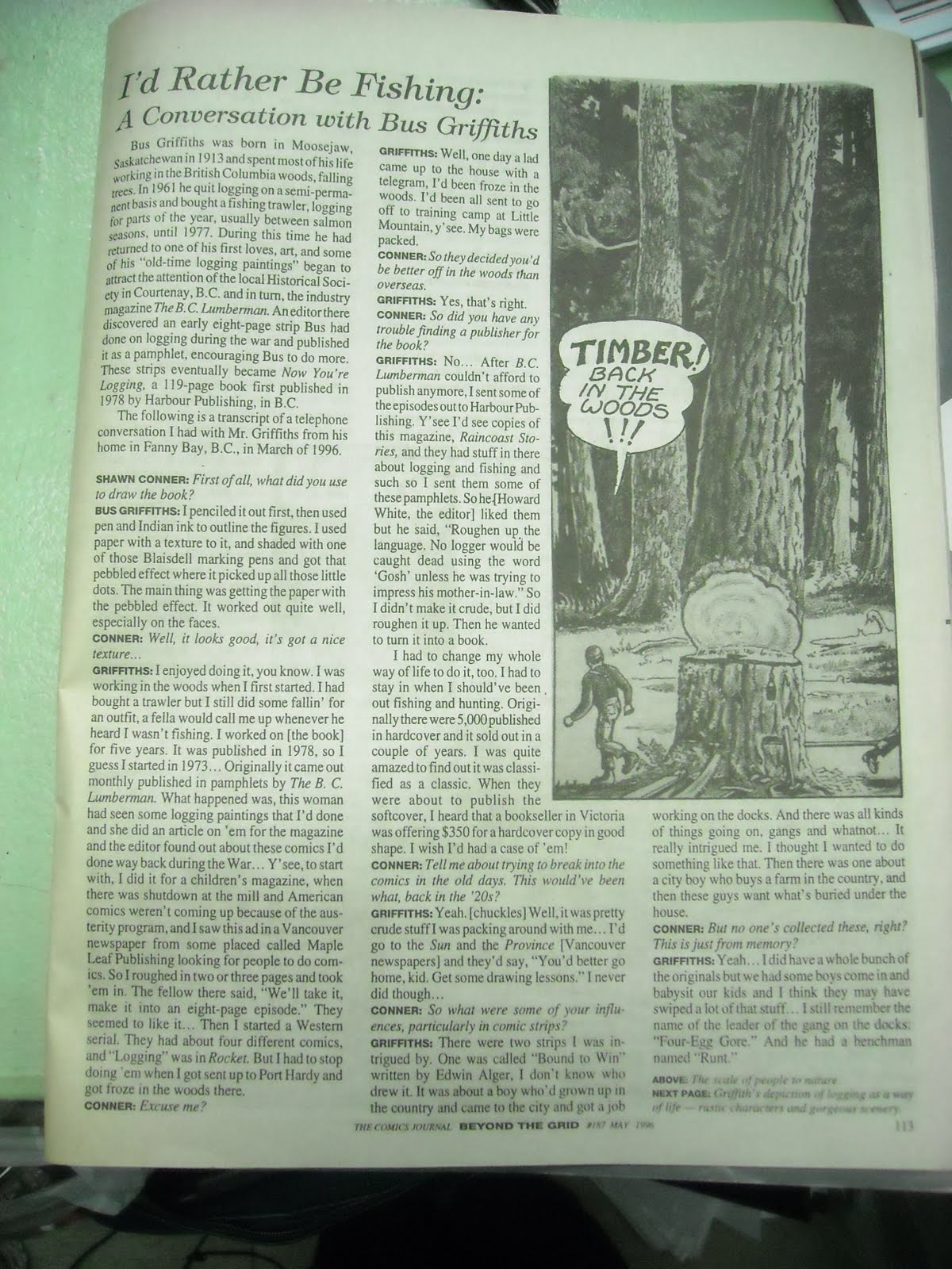
Bus Griffiths Interview CJ 187


For Brad Mackay:

Bus Griffiths is the missing link of Canadian comics history, connecting 1920s comics with the Canadian Whites 1940s comic books, to graphic novels, with his Now Your Logging, as we see here in this classic Comics Journal interview with Shawn Conner.

Griffiths had a great fluid lettering style coupled with that sexy inky outlining and shading technique that made his figures jump out at you, like a sort of porno woodsman icon.


Lots of unanswered questions, like what other comic stories did he have published, what work is still out there (ie, not stole by those damn fool babysitters), and, generally, What the fuck?! is this not the craziest Canadian comic ever????!!!???.

Monday, December 27, 2010

Sequential Updates


The latest from Sequential:

I posted the most recent Canadian Comics Bestseller List, reflecting some pre-Christmas sales from bookstores across the country.

For December 25th, I dug up some pages from George Feyer's obscurely forgotten Xmas classic, The Man in the Red Flannel Suit, a book of edgy Santa Claus cartoons.

You can see another classic Canadian magazine cartoonist, Peter Whalley, on this cover from Maclean's.

And here's a short interview with the writer/editor behind a new comic book floppy adaptation of The Communist Manifesto.

Wednesday, December 22, 2010

INTERVIEW: THE COMMUNIST MANIFESTO (ILLUSTRATED)

THE COMMUNIST MANIFESTO:

Chapter One: Historical Materialism

Karl Marx and Friedrich Engels

Edited by: George S. Rigakos

Illustrated by: Red Viktor.

(ISBN: 978-0-9812807-2-1 Paperback, 32pp)


Just in time for the Christmas shopping season from new imprint Red Quill Books, the first volume of The Communist Manifesto (Illustrated), a four part graphic novel treatment of the little book by Karl Marx and Fredric Engels that started it all way back in 1848.

by Bryan Munn

According to the series’ author and Carleton University professor George Rigakos, the book re-imagines the Manifesto as a heroic narrative, “a story about villains, victims and heroes,” says Rigakos. “The original work of Marx and Engels focused on the bourgeoisie, the proletariat and their heroes – the Communists, which will each constitute separate comic books in the series.”

Sequential caught up with Rigakos for the low-down on the project.

Sequential: You say in the Carleton press release that the comics approach will “engage more students.” Do you think the format is more engaging than something like film, lectures, or even the text itself? The youtube preview of the book is very filmic, for instance.

George Rigakos: There is something personal and enveloping about a comic book or graphic novel that you simply cannot get in any other format. It’s true that, historically, this has been a youth oriented industry. Personally, I used to love Daredevil. My friends and I would also rush to the comic book store to pick up the latest issue of Alpha Flight. Remember them? We couldn’t wait to see crossovers with other Marvel superheroes. But I still read graphic novels now. They’re powerful. Before this project I was reading through Maus by Spiegelman and the more recent Logicomix on the life and works of the logician Bertrand Russell. These are exciting reads for me. They can be just as powerful and stirring now as when, as a kid, I read Electra being killed by Bullseye. That panel is permanently etched on my brain.

I don’t know where I’ve read it but it seems true to me that the graphic novel is the ultimate artistic expression–if you put together the world’s greatest artist with the world’s greatest writer, they’re going to make a graphic novel.

Sequential: Can you talk a bit about the artist for the project, Red Victor? What is his or her real name? How did you come to collaborate and what was that process like? Did you write a script?

George Rigakos: Okay, I can tell you now that his real name is Victor Serra. Up until yesterday both he and the studio were reticent about using anything other than a pseudonym. He is an Argentinian artist who works for the illustration studio “Enroc” in Buenos Aires. I think he’s amazing. I was specifically looking for someone that did what I would consider to be a superhero or Marvel or DC comic book art. There are, of course, a number of excellent artists who work in this genre but they are almost all inevitably working for large comic book companies and are not able to work on a project like this. it seemed to me at the time that many of the artists who were politically motivated and able to work on this project also did not operate in this more commercial style. So, I actually had quite a difficult time getting anyone to agree to do this as a collaborative effort. I think they may have been a little suspicious about the fact that I was an academic. In any case, it worked out for the best because Victor was awesome.

The process consisted of my sending him panel descriptions with the accompanying caption boxes that were directly from the text of the Manifesto. I decided to stick with the conventional comic book format and break up the manifesto into four smaller parts. The original manifesto also had four chapters so this wasn’t as difficult as it seems. Most of the time Victor exceeded my expectations by doing even better than what was in my mind’s eye. In other cases, such as when I wanted to build an iconic representation of historical materialism through a human pyramid of battling classes over history this required tremendous back and forth.The most difficult part was using my own years of engagement with Marxist literature to try to distill from the Manifesto the most salient parts because you simply cannot put the entire text into a comic book. The goal was to make the manifesto as relevant today as it was in the middle of the 19th century; to try to match up the words of Engels and Marx with contemporary images that would not only resonate with readers but rattle them.

So that was a major creative liberty on my part that some orthodox Marxists may not like. The other indulgence was to create a prologue for each of the four chapters that also told a story. For example, in chapter one called “historical materialism” we begin with the scene of an old revolutionary trudging through a downpour in modern-day Highgate Cemetery. It’s a reckoning of sorts that I think almost all revolutionaries and leftists secretly fantasize about. So, I made it happen.

Sequential: What is the structure of the book? How can you make a manifesto that is equal parts history lesson, economic analysis, and call to arms into a sequential narrative?

George Rigakos: It’s actually not that difficult. The manifesto lends itself to this type of organization. Not necessarily on a panel to panel story-line basis but definitely on a thematic or grand narrative level. The history of civilization is the history of class struggle. The bourgeoisie are only the most recent oppressors. The proletarians are cheated and immiserated. The communists will rescue us all… Of course, I am simplifying but it is such a romantic text. Anyone who reads through it will understand why it is so useful for despotic and totalitarian regimes. They legitimized themselves on the back of people’s aspirations for a better tomorrow. They co-opted the future.

Sequential: Why Marxism? How do you identify politically yourself? Marxist, communist, socialist? Are you active politically as a part of a group/how would you characterize your praxis? What aspects of the Manifesto do you think should or do resonate the most today in our lives?

George Rigakos: Well I’m a trained sociologist. As a sociologist you can’t do science without understanding Marx. It would be like a physicist disavowing Newton. So, I am as much a Marxist as I am a Foucauldian or a Baudrillardian, etc… I consider myself first a scholar which means Marx can be very wrong. He is fallible. It just turns out that when you test his analysis of capitalism he’s mostly right. His theories still explain more than contemporary economics.

But if you’re asking me how I’d identify myself politically I’d say “socialist” which means a commitment to create a space for collective resistance to power by undermining the material and cultural forces of domination. I hope that Red Quill and our work can be a vehicle for this resistance.

Sequential: What do you think you can add to the field of non-fiction comics treatments of Marxism, considering that some big names like Robert Crumb, Spain Rodriguez, Rius have dealt with aspects of marxism, Marx and his work?

George Rigakos: I think stylistically, the superhero style and the comic book format is a key difference. This manifesto uses accessible imagery and popular art — what is a clearly identifiable hegemonic comic book style — to undermine accepted sensibilities. Alternative or oppositional politics often produce alternative or oppositional art which is not as readily accessible. While this oppositional art can indeed be very powerful and rich I wanted the look of the Manifesto instead to be like a commercial Marvel or DC comic book. Can you imagine if discussions of communism were as culturally embedded as Superman or Batman?


[interview originally published on Sequentialpulp.ca]


Saturday, November 13, 2010

Sequential at Word on the Street, 2009

Wow, actual video of Max and myself interviewing Brad Mackay and Kevin Boyd at WOTs in Toronto last year. Fantastic sound and crystal clear images for the panelfocusing on Canadian comics awards (Brad is head of the Doug Wright Awards and Kevin is one of the founders of the Joe Shuster Awards). Representing Sequential!

Part 1


Part 2

Saturday, November 06, 2010

The Stan Lee Hoard


The Mystery Hoard to end all Mystery Hoards!

Rumours today that Stan Lee has a giant storage unit full of Silver Age Marvel Comics art, possibly including Jack Kirby pages.

Stan may have been holding out on us.

Stan Lee has always had a central, if quizzical role to play in the controversy over creator rights and the fight for Jack Kirby's original art. Maybe he bought these things from reputable dealers at conventions over the years. Surely he didn't steal them from the Marvel offices or claim the pages as his own even though they were drawn by Jack Kirby and others?

Thursday, November 04, 2010

Statues of Canadian Poets


Robert Service, Killwinning, Ayrshire (England)


Octave Cremazie, Montreal


Francois Xavier Garneau, Quebec City


Al Purdy, Toronto


Thomas D'Arcy McGee, Ottawa


Pauline Johnson, Vancouver

Tuesday, September 07, 2010

Help Get Jay Stephens' "Oh, Brother!" Comic Strip in the Guelph Mercury


So I started a Facebook group dedicated to getting the great new strip by Guelph's own Emmy-award-winning cartoonist and super fun guy Jay Stephens a slot on the comics page of the Guelph Mercury. Please join the group if you'd like to help out, even if your not in Guelph right now.

"Oh, Brother!" is a new comic strip by Bob Weber Jr. and Jay Stephens. It was launched June 28, 2010, by King Features Syndicate but is not carried in Jay Stephens' own hometown newspaper, The Guelph Mercury. Please join our group and let The Mercury know that you want to see this great new strip on a daily basis.

Tuesday, July 20, 2010

Some things....

Snapshot:
Things I like on the internets today.

1. I guess Howard Chaykin is a genius. This 1970s comic book looks quite fascinating in miniature. Blown up, it scans well and is just golly gee weird. I thought about Chaykion this past week becasue I saw the new Predators movie and I remember him in that old Comics Journal or Amazing Heroes interview complaining about the first movie with Arnold and Jesse "The Body" Ventura, noting of the bloated 80s action directorial style, that it took fifteen minutes for them to get out of the goddam helicopter at the beginning of the movie. Not so the 2010 sequel.

2. There's something about the colour and the panels and the expressions in these old Kirby comics that transcends genre and period.

3. My local comic book store, The Dragon in Guelph, has been nominated for an Eisner "Spirit of Retailing" award (winner to be announced Friday at Comicon in San Diego) and I just want to say congrats to Jenn and the gang at the shop, even though I've only been in twice since they moved. They used to be at the end of the street my store is on and I would go in twice a week when I went to the coffee shop/bar next door. Sort of sad they moved but not sorry I stopped buying piles of shitty new comics published by Marvel and DC out of boredom and nostalgia. Anyway, the store is great: clean and professional with not too much space afforded to gamers and games and some good graphic novels on the shelves and support for manga, kids comics and comics for non-fans/casual readers.


2.

Wednesday, June 23, 2010

Seth Rescues Canadian Notes and Queries


Seth redesign for CNQ! Canadian Notes and Queries, the venerable literary journal launched in 1968, has received a facelift courtesy of the pen and brush of cartoonist Seth. Now the iconoclastic reviews and essays are matched in their wit, humour, and laser-sharp lacerating criticisms and insights by Seth's classically whimsical aesthetic, as expressed through his new logo, lettering, illustrations and cartoons, including new mascots Hudson and Stanfield, all wrapped up in a new cover by the artist.

Edited for many years by the dean of Canadian letters, John Metcalf, CNQ features some of the best reviews, interviews and literary history published in Canadian journalism. This issue (#79) features an hilarious eviseration of the Giller nominees (Ann Michaels included) by Ryan Bigge, Metcalf's "Century List" of the 40 best short story collections of the 20th Century, a review of Leon Rooke by Jeet Heer, and a cartoon by Seth. Plus tons of other stuff. A perfect companion to the latest issue of the Walrus which also has a Seth cover and an article by Andre Alexis about the decline in Canadian criticism which Alexis blames on Metcalf et al --the sentences vs structuralism/critic vs academic debate.

The magazine had been sporting a more accessible look over the last few years but it still fell 'squarely' into the literary journal pigeonhole, with photos of old writers and editors on the cover, long columns of unadorned print and a generally dry, serious design. The new design seems to open the mag up a bit, the shiny saddle-stitched cover and Seth's drawings and hand-lettering making the criticisms of the CanLit establishment and the variety of essays about short stories and Alice Munro's perfection more easily digestible.

Wednesday, May 19, 2010

Shirts Off!


On a bit of a Billy Childish kick lately.
http://tinyurl.com/2co783g

Thursday, May 13, 2010

Superman Mystery


I knew this was a story I had to link to thru Mystery Hoard because it has Superman and Mystery in its title. It's about a Superman painting in a library which is the original for the giant Superman treasury from the 70s.

It turns out the painting is the

first official full-length portrait of Superman, commissioned to promote the Superman radio show that went on the air in 1940 — an image for a medium you cannot see.

The painting’s provenance was a surprise to officials at Lehman College, in Bedford Park, the Bronx.

“I don’t think any of us realized what it was,” said Janet Munch, the reference librarian and college historian. “We knew who it was.”

It all began as Mr. Saunders prepared a biography of the illustrator who painted it, H.J. Ward, who had studied with the prolific painter N.C. Wyeth and also created portraits of the Lone Ranger and the Green Hornet. Mr. Saunders knew about the Superman painting because it had been reproduced on Page 45 of “Superman: The Complete History, the Life and Times of the Man of Steel” (Chronicle, 1998). But where was the painting itself?

The author of the book, Les Daniels, said last week that it was not in DC Comics’ offices when he was working on the book. “We used a photograph,” he said.

Martin Pasko, an author of “The Essential Superman Encyclopedia,” which will be published by Del Rey in August, was puzzled.

Sunday, May 02, 2010

2010 Wright Awards are coming.


Who Will Win???

The jury for this year's Doug Wright Awards is made up of a stellar coterie of writers and cartoonists:


Geoff Pevere (author, Toronto Star books critic)
Matt Forsythe (editor of Drawn!, author of "Ojingogo")
Carl Wilson (editor/writer Globe and Mail, author of "Let’s Talk About Lov...e: A Journey to the End of Taste")
Fiona Smyth (artist, cartoonist)

The ceremony takes place in Toronto May 8.

The host this year is actor and raconteur Peter Outerbridge.

Saturday, May 01, 2010

May Day 2010: Pass on Left


The Archie comics universe is one of scarcity and constant proletarian struggle. Witness this cover image from Mad House Annual #8, 1970. A generational-political schism emerges between the anachronistic beatnik Jughead stand-in and the lumpen appliance porters. A 1930s meets 2010 recessionary class conflict whose main expression is rejection. Rejection of logic. Rejection of good taste. Rejection of proportion. An upside-down world where repo-men both pass on the left, in the rejection sense, and pass on the left, in that they circumvent the already existing left to an outer left that is more left than left. By texting us with his ass, our hungry worker actually steps outside his inane scenario, into the realm of the possible.

"They are trying as directly as possible to sell you experiences, i.e. what you are able to do with the car, not the car as a product itself. An extreme example of this is this existing economic marketing concept, which basically evaluates the value of you as a potential consumer of your own life. Like how much are you worth, in the sense of all you will spend to buy back your own life as a certain quality life. You will spend so much in doctors, so much in beauty, so much in transcendental meditation, so much for music, and so on. What you are buying is a certain image and practice of your life. So what is your market potential, as a buyer of your own life in this sense? "

Slovoj Zizek, Believer magazine interview.

Further reading:

Making sure the recession will not pass the left by...

"We shall pass on to the misfortunes of our “Left” Communists in the sphere of home policy."

Friday, April 23, 2010

5 Superhero Movies I Like More Than Kick-Ass


So we finally saw Kick-Ass last night. Not having read the book besides seeing a few pages online and in interviews, I had to judge it solely as an original work and not an adaptation. The goofy plot --average joes with mental problems dress up as superheroes and kill gangsters, finding love and redemption along the way-- was dotted with several nice suspenseful action set pieces but the whole thing was marred by a laboured voiceover device and lots of other cliches that were insufficiently shielded by the film's generally ironic tone. Sure, superhero stories are all going to have an element of the cliche, being basically made up of squashed-together elements of action movies, bad scifi, crime fiction, and adventure comic strips, but at this point we expect a little more from the genre, given its varied history in print and on screen, than some half-hearted, cynically controversial post-modern toying with convention and morality. At this point, it's all in the execution and it's no surprise that when we walked out of the theatre last night, the poster for the movie that is replacing Kick-Ass, a romantic comedy with Jennifer Lopez, was already in place.

Other, Better Superhero Movies (many from the same year)

5. Batman (1968) This movie version of the Adam West tv show has all the qualities that made the series great. West's deadpan mock heroism, great visuals, classic villain/b-listers mugging and camping it up, a goofy plot and a tone that makes it accessible to a variety of audiences.


4. Ultraman (1967)
My first introduction to the character and the Japanese tv show, this movie condenses the series into a crazy battle royal featuring the giant space policeman and a cast of costumed monsters (including Gomora). Very interesting colour, humour, and fantastic miniature and set design combine with a confusing garbled narrative, traditionally funny dubbing, and a sense of childish wonder to make a very entertaining work of art.


3. Spider-Man 2 (2004)
The best of the recent crop of Marvel comics adaptations, this episode has all the great soap-opera romance of the Lee-Romita comics with improved special effects, just enough jokes, and the continuing appeal of Tobey Maguire.


2. The Incredibles (2004)
This animated take on superheroic family dynamics a la the Lee/Kirby Fantastic Four is funny, well-plotted, has good vocal performances and is gorgeous. The animation naturalizes the superpowered action in a way that seems impossible for live-action and the film has many nods to comics and previous movies that doesn't detract from a simple story with great design, "effects," and affection.


1. Kung Fu Hustle (2004) Steven Chow's chopsocky epic is a wonder-filled homage to Hong Kong genre film but it also is about the secret origin of a superhero who learns that with great power comes great responsibility. Crosses over the thin line that separates kung fu movies from superheroes, filled as it is with secret identities, costumes, and super powers. A fast-moving, funny plot, really quite beautiful music, and, of course, fantastic gravity-defying fight scenes.

Monday, April 19, 2010

New Stuff/Netbook Update

>

-Two new things over at Sequential: this week's Canadian Bestseller List for graphic novels, and a review of Michael DeForge's new book, Lose #2.

-Michel Rabagliati is a bestseller in France, in Canadian bestseller terms.

-For the Wright Awards I'm going to be listing some fundraising art by past nominees on ebay. Some nice homages to classic DC superheroes from the likes of Joe Ollman, Jeff Lemire (picture) and Diana Tamblyn are already "in the can." Plus more I haven't seen. Exciting!

-via twitter, cartoonist Hope Larson is adapting Madelyn L'Engle's A Wrinkle in Time for Farrar Straus & Giroux, even though she notes L'Engle didn't want her books illo'd. She may have a fine line to walk pleasing older fans while introducing a new generation to a classic in her own style.

-Toronto artist/performer Robert Dayton has been posting scans of the awesome Nellie No-Date strips by Ogden Whitney.

Sunday, April 04, 2010

Thor News


Yes, the Thor movie news keeps rolling in. What a marvelous event this film will be.

And yet, no mention to date about making Stonehammer beer the official beverage of the franchise. What gives, Marvel and producers Victoria Alonso, Louis D'Esposito, Kevin Feige, Alicia Gelernt, Craig Kyle, Stan Lee, Patricia Whitcher, et al?

Wednesday, March 31, 2010

New look for Sequential!

Publisher Max Douglas has updated the look of Sequential. The newsblog of Canadian comic book news and cilture bow has an updated, more magazine-y look, in keeping with our status as an annual print journal and more varied webcontent (look for more interviews and reviews in the near future). Check out the new wordpress-o-rific site.

McSweeney's 33: San Francisco Panorama


Pretty excited: just picked up the latest issue of McSweeney's: The San Francisco Panorama newspaper issue, featuring a giant full-colour comics section with strips by Dan Clowes, Chris Ware, Seth, Adrian Tomine, and more! To make the week complete, also picked up The Believer's annual film issue. Whew!